Premium craft beer packaging feels valuable when it makes the beer easy to recognize, easy to understand, and practical to produce. Premium finishes are worth the added packaging budget when they reinforce a clear brand idea without creating avoidable printing, filling, or shipping problems.

Start by choosing the container and label format before finalizing artwork. Then compare packaging design agency quotes, label printing options, and material samples against the needs of your retail channel.
A simple, well-produced paper label can look more considered than a crowded can covered in effects. The right choice depends on your container, production run, shelf environment, and the information your market requires.
At a Glance
- Choose the package format first: cans, bottles, sleeves, cartons, and multipacks each create different design and production constraints.
- Use premium finishes selectively: foil, embossing, spot varnish, and tactile stocks can add impact, but they may also increase complexity and cost.
- Test before committing: review artwork on real container dimensions, against print specifications, and from normal retail viewing distance.
| Packaging Format | Visual Effect | Production Considerations | Key Quote Variables |
|---|---|---|---|
| Aluminum can | Strong shelf presence with a broad printable surface | Must fit can dimensions, seams, filling-line requirements, and readable information areas | Container format, artwork setup, print method, finishes, order quantity |
| Glass bottle with paper label | Can feel classic, tactile, and highly considered | Label fit, bottle shape, adhesive performance, shipping durability | Label stock, label shape, print finishing, bottle dimensions |
| Shrink sleeve | Offers a large, immersive graphic area | Requires careful attention to distortion, seams, and container geometry | Container template, sleeve specification, artwork adjustments, run requirements |
| Carton or multipack | Creates a stronger retail block and gift-ready presentation | Must protect products while supporting handling, display, and fulfillment | Board material, structure, print finish, pack configuration |
What Makes Beer Packaging Feel Premium at the Point of Sale
The three packaging priorities: recognition, product clarity, and production fit
Premium packaging is not simply the most decorative option. It should help a shopper recognize the brewery, understand the beer, and notice the product without working too hard. Recognition comes from a consistent visual system. Product clarity comes from readable style names, useful hierarchy, and clear information. Production fit means the design works with the selected container, label printer, filling line, and retail channel.
A design can look excellent on a screen and still fail in production if critical text falls near a seam, a barcode is difficult to scan, or a finish does not suit the material. Treat packaging design and packaging procurement as connected decisions rather than separate tasks.
When a simple label can look more premium than an over-designed can
A restrained label often feels premium when its paper, typography, spacing, and color choices are deliberate. A clear beer name and a confident visual hierarchy can create more shelf authority than crowded illustration, excessive effects, or too many competing messages.
Specialty print finishes can support a premium retail position, but they should have a job. Foil may highlight a brewery mark. Embossing may add tactile detail. Spot varnish may separate a key graphic from the background. If the finish makes mandatory information less readable or complicates a production process, it may not be the right investment.
Compare Packaging Formats Before Investing in Artwork
Cans, bottles, shrink sleeves, and paper labels: where each option works best
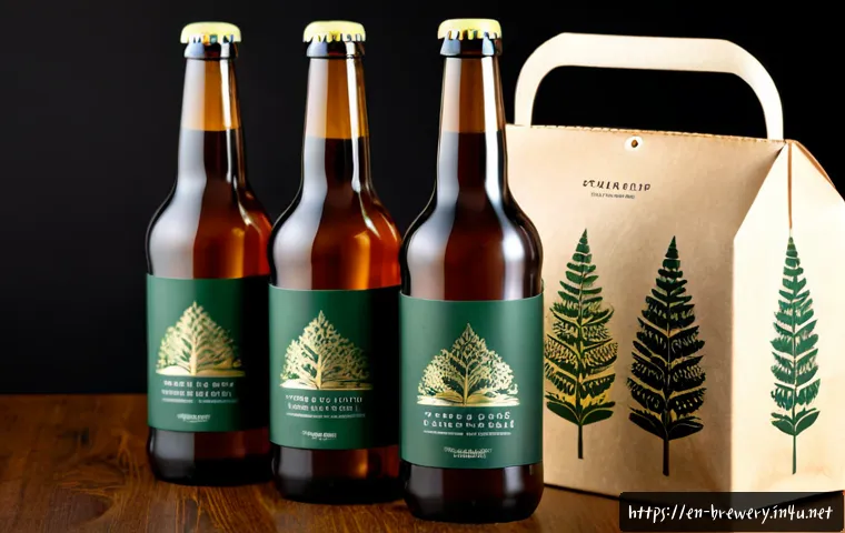
Aluminum cans provide a prominent canvas and suit breweries seeking a modern, graphic-led presentation. Glass bottles can support a traditional or collectible feel, especially when paired with a well-selected paper label. Shrink sleeves provide broad design coverage but need close attention to the container shape and print setup. Paper labels can offer useful flexibility for brand systems, seasonal changes, and material-led design.
No format is universally premium. The better question is whether the format supports your beer range, operational setup, and expected customer experience. Confirm what a canning, bottling, or label printing supplier can support before artwork becomes too fixed.
Comparison table: shelf impact, flexibility, operational fit, and cost drivers
The table above is best used as an early filter, not as a final vendor decision. Unit cost can change with container type, order quantity, finish specification, and market conditions. Ask packaging suppliers to separate artwork preparation, material choices, printing requirements, and any production-related limitations in their quote.
Secondary packaging for multipacks, gift boxes, and direct-to-consumer shipping
Secondary packaging does more than hold products together. Multipacks and cartons can improve shelf blocking, provide extra space for product information, and create a more finished retail presentation. Gift boxes can make a limited release feel intentional, while shipping-oriented packaging must also account for durability during fulfillment.
Keep the hierarchy consistent across the can or bottle and the outer pack. A shopper should be able to identify the brewery and beer style whether they see one unit, a multipack, or a boxed set.
Build a Visual System That Works Across a Beer Range
Creating clear distinctions between styles, ABV, seasonal releases, and collaborations
A strong beer range has a repeatable framework and enough variation to prevent confusion. Use a stable brewery identifier, then create distinctions through color, naming, illustration, or a controlled typography system. Beer style, alcohol information, and release details need enough visual priority to be found quickly.
For seasonal releases and collaborations, preserve a recognizable core structure even when the artwork becomes more expressive. That approach gives the special release its own character while maintaining a clear connection to the brewery.
Using color, typography, illustration, and finish without losing readability
Color can help a beer stand apart, but it should not be the only signifier. Typography must remain readable at retail distance, and illustration should not obscure essential product information. Information hierarchy matters most when shoppers are comparing several similar products on a shelf.
Before approving a final direction, view it at realistic size. Check whether the brewery name, beer name, style, and required copy remain clear in typical store lighting and among competing packages.
Designing for taproom customers versus retail shoppers
Taproom visitors may have more time to explore a label, ask questions, and engage with a limited release story. Retail shoppers often make a faster comparison from a distance. A package intended for broader retail distribution should make the central product message immediately visible.
If one design needs to serve both settings, prioritize fast recognition first and deeper storytelling second. Side panels, secondary labels, cartons, and digital touchpoints can carry supporting detail without crowding the front-facing design.
Production Checks That Prevent Expensive Packaging Mistakes
Container templates, bleed, safe areas, seams, and barcode placement
Use the actual template supplied for the selected container or label format. Check bleed, safe areas, seams, curves, and barcode placement before production approval. These areas can affect the legibility of fine type, the placement of key artwork, and the usability of retail information.
Do not assume one template will transfer cleanly to another container size. Even a closely related can, bottle, carton, or sleeve can require different artwork handling.
Color proofing, material tests, and finish samples
Color can shift across print processes, materials, and finishes. Review proofs and physical samples where possible, especially when a brand relies on a signature color, subtle tonal differences, metallic elements, or tactile paper stocks. A finish that looks refined in a presentation may behave differently on the final material.

Packaging design agencies, printers, and production specialists can each provide useful input here. Compare print specifications before requesting quotes, and make sure all parties are working from the same version of the artwork and container details.
Labeling and recycling information to confirm before print approval
Beer labels and packaging commonly need space for legally required information, but requirements vary by market and product type. Confirm applicable alcohol-content, health-warning, deposit, recycling, and labeling requirements in the relevant sales jurisdiction before print approval.
Leave adequate space for this information early in the design process. Trying to add it after the visual system is complete can weaken clarity and create unnecessary production revisions.
Packaging Strategy by Brewery Situation
New breweries building a recognizable core range
A new brewery benefits from a system that can expand without losing recognition. Establish a reliable brand mark, a clear type hierarchy, and an approach to color or artwork that distinguishes beer styles. Avoid building a core range around effects that are difficult to repeat consistently across future releases.
Small-batch and limited-release beers with short production runs
Limited releases can support more experimentation, but the package still needs to work with available printing and production options. Consider whether a flexible label format, sleeve, or secondary packaging element better suits changing release schedules and artwork needs. Confirm supplier turnaround expectations and minimum order requirements before choosing the format.
Established breweries refreshing packaging without confusing existing customers
A refresh works best when it keeps the most recognizable signals while improving clarity or shelf impact. Preserve familiar elements where they carry brand value, then update the hierarchy, color use, illustration, or finish with purpose. Test the revised package next to the existing range to ensure loyal customers can still identify it.
Selection Criteria and Comparison Summary
When to hire a packaging designer, brand studio, or production specialist
Hire a packaging designer when the main need is a container-specific visual system and artwork execution. A brand studio may be appropriate when the brewery needs broader positioning, naming, and identity work alongside packaging. A production specialist can be especially valuable when container compatibility, print specifications, or filling-line constraints are central concerns.
What to include in a packaging design and print quote request
A useful supplier brief should include the chosen container type, available dimensions or templates, intended sales channels, beer range scope, desired materials or finishes, required information areas, and target production timing. State whether the project includes single units, multipacks, cartons, gift packaging, or direct-to-consumer shipping components.
Compare print specifications before requesting quotes. Official supplier pages and detailed quote documents are the right place to verify supported materials, production requirements, turnaround expectations, and minimum order conditions.
Final checklist: brand fit, compliance review, production readiness, and total cost
Check these points before approval: Does the package clearly identify the brewery and beer? Is the beer style and required information readable? Has the artwork been checked against the final container template? Have color, material, and finish samples been reviewed? Have relevant labeling and recycling requirements been confirmed? Does the total packaging plan account for printing, packing, fulfillment, and retail handling?
Wrapping Up
Premium craft beer packaging is a balance between visual impact and practical execution. The strongest result usually comes from a clear brand system, a suitable container format, and careful production checks. Start with the shelf and operational reality, then use specialty materials or finishes where they strengthen the product story. A well-prepared supplier brief makes packaging design quotes easier to compare and reduces avoidable revisions.
Useful Things to Know
Retail distance matters: packaging should be reviewed from the distance at which shoppers will first see it.
Templates are production tools: final artwork should be checked on the correct container or label specification.
Secondary packs matter: cartons, multipacks, and gift packaging can influence both presentation and fulfillment.
Finishes need a purpose: use them to reinforce hierarchy, texture, or brand recognition rather than decoration alone.
Important Notes
Exact packaging design, printing, and material costs cannot be determined without the market, order quantity, container type, and finish specification. Labeling, deposit, recycling, alcohol-content, and health-warning rules vary by jurisdiction and should be confirmed for the brewery’s sales market. Supplier capabilities, turnaround time, minimum order requirements, and filling-line compatibility also require direct verification. A packaging redesign may improve clarity and brand presentation, but the final sales impact of any single redesign cannot be assumed.
Frequently Asked Questions
Q1. How much should a small brewery budget for premium beer packaging design and printing?
A1. The budget depends on the market, order quantity, container type, material selection, print method, and finish specification. Request separate details for packaging design, label printing, containers, secondary packaging, and production setup so quotes can be compared on the same basis.
Q2. Are cans or bottles better for a premium craft beer brand?
A2. Either can support a premium brand. Cans can create a bold graphic presence, while bottles and paper labels can provide a classic or tactile presentation. The better option depends on shelf goals, shipping needs, filling-line compatibility, and the visual system you want to build.
Q3. What should a brewery check before approving beer label artwork for production?
A3. Confirm the final container template, bleed, safe areas, seams, barcode placement, information hierarchy, print specifications, color proofing, and material samples. Also verify the labeling, recycling, deposit, alcohol-content, and health-warning requirements that apply in the intended sales jurisdiction.